


Create Stylish CSS Hover Social Media Icons | Glassmorphism UI
Are you looking for a cool CSS project to practice? 🎨
In this tutorial, we’ll build a stylish hover social media icon effect using only HTML and CSS.
This design uses a glassmorphism style with smooth hover animations — perfect for portfolio websites, landing pages, and creative UIs.
🚀 Features of the Project
✅ Pure HTML & CSS (no JavaScript required)
✅ Glassmorphism design (modern blurred background effect)
✅ Smooth hover animations for icons
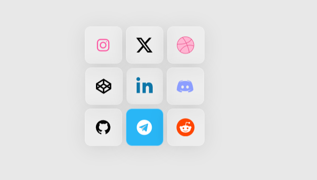
✅ Supports multiple social platforms: Instagram, Twitter, Dribbble, CodePen, LinkedIn, Discord, GitHub, Telegram, Reddit
📂 Project Structure
📁 Hover-for-Social
 ┣ 📜 index.html
┣ 📜 style.css Step-by-Step Guide
1. HTML (index.html)
We create a main container with cards for each social media icon. SVG icons are used for better quality and easy customization.
  <!DOCTYPE html>
  <html lang="en">
  <head>
      <meta charset="UTF-8">
      <meta name="viewport" content="width=device-width, initial-scale=1.0">
      <link rel="stylesheet" href="./style.css">
      <title>Hover for social | LearnNewThings</title>
  </head>
  <body>
      <div class="main">

        <div class="card">
          <svg class="instagram" xmlns="http://www.w3.org/2000/svg" xmlns:xlink="http://www.w3.org/1999/xlink" viewBox="0,0,256,256" width="30px" height="30px" fill-rule="nonzero"><g fill-rule="nonzero" stroke="none" stroke-width="1" stroke-linecap="butt" stroke-linejoin="miter" stroke-miterlimit="10" stroke-dasharray="" stroke-dashoffset="0" font-family="none" font-weight="none" font-size="none" text-anchor="none" style="mix-blend-mode: normal"><g transform="scale(8,8)"><path d="M11.46875,5c-3.55078,0 -6.46875,2.91406 -6.46875,6.46875v9.0625c0,3.55078 2.91406,6.46875 6.46875,6.46875h9.0625c3.55078,0 6.46875,-2.91406 6.46875,-6.46875v-9.0625c0,-3.55078 -2.91406,-6.46875 -6.46875,-6.46875zM11.46875,7h9.0625c2.47266,0 4.46875,1.99609 4.46875,4.46875v9.0625c0,2.47266 -1.99609,4.46875 -4.46875,4.46875h-9.0625c-2.47266,0 -4.46875,-1.99609 -4.46875,-4.46875v-9.0625c0,-2.47266 1.99609,-4.46875 4.46875,-4.46875zM21.90625,9.1875c-0.50391,0 -0.90625,0.40234 -0.90625,0.90625c0,0.50391 0.40234,0.90625 0.90625,0.90625c0.50391,0 0.90625,-0.40234 0.90625,-0.90625c0,-0.50391 -0.40234,-0.90625 -0.90625,-0.90625zM16,10c-3.30078,0 -6,2.69922 -6,6c0,3.30078 2.69922,6 6,6c3.30078,0 6,-2.69922 6,-6c0,-3.30078 -2.69922,-6 -6,-6zM16,12c2.22266,0 4,1.77734 4,4c0,2.22266 -1.77734,4 -4,4c-2.22266,0 -4,-1.77734 -4,-4c0,-2.22266 1.77734,-4 4,-4z"></path></g></g></svg>
        </div>

        <div class="card">
          <svg class="twitter" xmlns="http://www.w3.org/2000/svg" viewBox="0 0 24 24" version="1.1" width="30px" height="30px">
              <path d="M18.244 2.25h3.308l-7.227 8.26 8.502 11.24H16.17l-5.214-6.817L4.99 21.75H1.68l7.73-8.835L1.254 2.25H8.08l4.713 6.231zm-1.161 17.52h1.833L7.084 4.126H5.117z" />
            </svg>
        </div>

        <div class="card">
          <svg class="dribble" xmlns="http://www.w3.org/2000/svg" viewBox="0 0 40 40" width="30px" height="30px"><path d="M20,38.5C9.799,38.5,1.5,30.201,1.5,20S9.799,1.5,20,1.5S38.5,9.799,38.5,20S30.201,38.5,20,38.5z"></path><path fill="#ea4c89" d="M20,2c9.925,0,18,8.075,18,18s-8.075,18-18,18S2,29.925,2,20S10.075,2,20,2 M20,1 C9.507,1,1,9.507,1,20s8.507,19,19,19s19-8.507,19-19S30.493,1,20,1L20,1z"></path><path fill="none" stroke="#ea4c89" stroke-miterlimit="10" d="M28.352 36.914c0 0-3.032-21.087-15.63-34.292M1.269 17.848c0 0 24.2 2.117 32.075-11.102M7.804 34.152c0 0 8.624-19.807 31.058-12.194"></path></svg>
        </div>

        <div class="card">
          <svg class="codepen" xmlns="http://www.w3.org/2000/svg" viewBox="0 0 50 50" width="30px" height="30px"><path d="M 25 4 L 4 17.34375 L 4 32.652344 L 25 46 L 46 32.65625 L 46 17.34375 Z M 25 29.183594 L 19.066406 25.070313 L 25 21.023438 L 30.933594 25.070313 Z M 27 17.605469 L 27 9.949219 L 40.429688 18.484375 L 34.410156 22.65625 Z M 23 17.605469 L 15.589844 22.65625 L 9.570313 18.484375 L 23 9.949219 Z M 12.09375 25.042969 L 8 27.832031 L 8 22.203125 Z M 15.570313 27.453125 L 23 32.605469 L 23 40.050781 L 9.589844 31.527344 Z M 27 32.605469 L 34.429688 27.453125 L 40.410156 31.527344 L 27 40.050781 Z M 37.90625 25.042969 L 42 22.203125 L 42 27.832031 Z"></path></svg>
        </div>

        <div class="card">
          <svg class="linkedin" xmlns="http://www.w3.org/2000/svg" width="30px" height="30px" viewBox="0 0 448 512">
              <path d="M100.28 448H7.4V148.9h92.88zM53.79 108.1C24.09 108.1 0 83.5 0 53.8 0 24.5 24.09 0 53.79 0c29.5 0 53.8 24.5 53.8 53.8s-24.3 54.3-53.8 54.3zM447.9 448h-92.4V302.4c0-34.7-12.4-58.4-43.4-58.4-23.6 0-37.6 15.8-43.7 31.1-2.3 5.6-2.8 13.5-2.8 21.4V448h-92.5s1.2-267.4 0-295H269v41.8c12.3-19 34.3-46.2 83.4-46.2 60.9 0 106.5 39.8 106.5 125.2V448z"/>
            </svg>
        </div>

        <div class="card">
          <svg class="discord" height="30px" width="30px" viewBox="0 0 48 48" xmlns="http://www.w3.org/2000/svg"><path d="M40,12c0,0-4.585-3.588-10-4l-0.488,0.976C34.408,10.174,36.654,11.891,39,14c-4.045-2.065-8.039-4-15-4s-10.955,1.935-15,4c2.346-2.109,5.018-4.015,9.488-5.024L18,8c-5.681,0.537-10,4-10,4s-5.121,7.425-6,22c5.162,5.953,13,6,13,6l1.639-2.185C13.857,36.848,10.715,35.121,8,32c3.238,2.45,8.125,5,16,5s12.762-2.55,16-5c-2.715,3.121-5.857,4.848-8.639,5.815L33,40c0,0,7.838-0.047,13-6C45.121,19.425,40,12,40,12z M17.5,30c-1.933,0-3.5-1.791-3.5-4c0-2.209,1.567-4,3.5-4s3.5,1.791,3.5,4C21,28.209,19.433,30,17.5,30z M30.5,30c-1.933,0-3.5-1.791-3.5-4c0-2.209,1.567-4,3.5-4s3.5,1.791,3.5,4C34,28.209,32.433,30,30.5,30z"></path></svg>
        </div>

        <div class="card">
          <svg class="github" xmlns="http://www.w3.org/2000/svg" viewBox="0 0 30 30" width="30px" height="30px"><path d="M15,3C8.373,3,3,8.373,3,15c0,5.623,3.872,10.328,9.092,11.63C12.036,26.468,12,26.28,12,26.047v-2.051 c-0.487,0-1.303,0-1.508,0c-0.821,0-1.551-0.353-1.905-1.009c-0.393-0.729-0.461-1.844-1.435-2.526 c-0.289-0.227-0.069-0.486,0.264-0.451c0.615,0.174,1.125,0.596,1.605,1.222c0.478,0.627,0.703,0.769,1.596,0.769 c0.433,0,1.081-0.025,1.691-0.121c0.328-0.833,0.895-1.6,1.588-1.962c-3.996-0.411-5.903-2.399-5.903-5.098 c0-1.162,0.495-2.286,1.336-3.233C9.053,10.647,8.706,8.73,9.435,8c1.798,0,2.885,1.166,3.146,1.481C13.477,9.174,14.461,9,15.495,9 c1.036,0,2.024,0.174,2.922,0.483C18.675,9.17,19.763,8,21.565,8c0.732,0.731,0.381,2.656,0.102,3.594 c0.836,0.945,1.328,2.066,1.328,3.226c0,2.697-1.904,4.684-5.894,5.097C18.199,20.49,19,22.1,19,23.313v2.734 c0,0.104-0.023,0.179-0.035,0.268C23.641,24.676,27,20.236,27,15C27,8.373,21.627,3,15,3z"></path></svg>
        </div>

        <div class="card">
          <svg class="telegram" xmlns="http://www.w3.org/2000/svg" viewBox="0 0 48 48" width="30px" height="30px"><path d="M24 4A20 20 0 1 0 24 44A20 20 0 1 0 24 4Z"></path><path fill="#fff" d="M33.95,15l-3.746,19.126c0,0-0.161,0.874-1.245,0.874c-0.576,0-0.873-0.274-0.873-0.274l-8.114-6.733 l-3.97-2.001l-5.095-1.355c0,0-0.907-0.262-0.907-1.012c0-0.625,0.933-0.923,0.933-0.923l21.316-8.468 c-0.001-0.001,0.651-0.235,1.126-0.234C33.667,14,34,14.125,34,14.5C34,14.75,33.95,15,33.95,15z"></path><path fill="#b0bec5" d="M23,30.505l-3.426,3.374c0,0-0.149,0.115-0.348,0.12c-0.069,0.002-0.143-0.009-0.219-0.043 l0.964-5.965L23,30.505z"></path><path fill="#cfd8dc" d="M29.897,18.196c-0.169-0.22-0.481-0.26-0.701-0.093L16,26c0,0,2.106,5.892,2.427,6.912 c0.322,1.021,0.58,1.045,0.58,1.045l0.964-5.965l9.832-9.096C30.023,18.729,30.064,18.416,29.897,18.196z"></path></svg>
        </div>

        <div class="card">
          <svg class="reddit" xmlns="http://www.w3.org/2000/svg" xmlns:xlink="http://www.w3.org/1999/xlink" version="1.1" width="30" height="30" viewBox="0 0 256 256" xml:space="preserve">
          <defs>
          </defs>
          <g style="stroke: none; border-radius:50%; stroke-width: 0; stroke-dasharray: none; stroke-linecap: butt; stroke-linejoin: miter; stroke-miterlimit: 10; fill: none; fill-rule: nonzero; opacity: 1;" transform="translate(1.4065934065934016 1.4065934065934016) scale(2.81 2.81)">
            <circle cx="45" cy="45" r="45" style="stroke: none; stroke-width: 0; stroke-dasharray: none; stroke-linecap: butt; stroke-linejoin: miter; stroke-miterlimit: 10; fill-rule: nonzero; opacity: 1;" transform="matrix(1 0 0 1 0 0)"></circle>
            <path d="M 75.011 45 c -0.134 -3.624 -3.177 -6.454 -6.812 -6.331 c -1.611 0.056 -3.143 0.716 -4.306 1.823 c -5.123 -3.49 -11.141 -5.403 -17.327 -5.537 l 2.919 -14.038 l 9.631 2.025 c 0.268 2.472 2.483 4.262 4.955 3.993 c 2.472 -0.268 4.262 -2.483 3.993 -4.955 s -2.483 -4.262 -4.955 -3.993 c -1.421 0.145 -2.696 0.973 -3.4 2.204 L 48.68 17.987 c -0.749 -0.168 -1.499 0.302 -1.667 1.063 c 0 0.011 0 0.011 0 0.022 l -3.322 15.615 c -6.264 0.101 -12.36 2.025 -17.55 5.537 c -2.64 -2.483 -6.801 -2.36 -9.284 0.291 c -2.483 2.64 -2.36 6.801 0.291 9.284 c 0.515 0.481 1.107 0.895 1.767 1.186 c -0.045 0.66 -0.045 1.32 0 1.98 c 0 10.078 11.745 18.277 26.23 18.277 c 14.485 0 26.23 -8.188 26.23 -18.277 c 0.045 -0.66 0.045 -1.32 0 -1.98 C 73.635 49.855 75.056 47.528 75.011 45 z M 30.011 49.508 c 0 -2.483 2.025 -4.508 4.508 -4.508 c 2.483 0 4.508 2.025 4.508 4.508 s -2.025 4.508 -4.508 4.508 C 32.025 53.993 30.011 51.991 30.011 49.508 z M 56.152 62.058 v -0.179 c -3.199 2.405 -7.114 3.635 -11.119 3.468 c -4.005 0.168 -7.919 -1.063 -11.119 -3.468 c -0.425 -0.515 -0.347 -1.286 0.168 -1.711 c 0.447 -0.369 1.085 -0.369 1.544 0 c 2.707 1.98 6.007 2.987 9.362 2.83 c 3.356 0.179 6.667 -0.783 9.407 -2.74 c 0.492 -0.481 1.297 -0.47 1.779 0.022 C 56.655 60.772 56.644 61.577 56.152 62.058 z M 55.537 54.34 c -0.078 0 -0.145 0 -0.224 0 l 0.034 -0.168 c -2.483 0 -4.508 -2.025 -4.508 -4.508 s 2.025 -4.508 4.508 -4.508 s 4.508 2.025 4.508 4.508 C 59.955 52.148 58.02 54.239 55.537 54.34 z" style="stroke: none; stroke-width: 1; stroke-dasharray: none; stroke-linecap: butt; stroke-linejoin: miter; stroke-miterlimit: 10; fill-rule: nonzero; opacity: 1;" transform="matrix(1 0 0 1 0 0)" stroke-linecap="round"></path>
          </g>
          </svg>
        </div>
        <p class="text">HOVER<br><br>FOR<br><br>SOCIAL</p>
        <div class="main_back"></div>
      </div>

  </body>
</html>2. CSS (style.css)
The magic happens in CSS. We use hover selectors to change background colors and icon fill.
@import url('https://fonts.googleapis.com/css2?family=Poppins:wght@400;600&display=swap');

body {
  background-color:#e8e8e8;
}

.main_back {
  position:absolute;
  border-radius:10px;
  transform:rotate(90deg);
  width:11em;
  height:11em;
  background:linear-gradient(270deg,#03a9f4,#cc39a4,#ffb5d2);
  z-index:-2;
  box-shadow:inset 0px 0px 180px 5px #ffffff;
}

.main {
  position:absolute;
  top:50%;
  left:50%;
  transform:translate(-50%,-50%);
  display:flex;
  flex-wrap:wrap;
  width:14em;
  align-items:center;
  justify-content:center;
  z-index:-1;
  font-family:'Poppins',sans-serif;
}

.card {
  width:60px;
  height:60px;
  border-top-left-radius:10px;
  background:lightgrey;
  transition:.4s ease-in-out,.2s background-color ease-in-out,.2s background-image ease-in-out;
  background:rgba(255,255,255,0.596);
  backdrop-filter:blur(5px);
  border:1px solid transparent;
  -webkit-backdrop-filter:blur(5px);
  display:flex;
  align-items:center;
  justify-content:center;
}

.card .instagram {
  opacity:0;
  transition:.2s ease-in-out;
  fill:#fd58a2;
}

.card:nth-child(2) {
  border-radius:0px;
}

.card:nth-child(2) .twitter {
  opacity:0;
  transition:.2s ease-in-out;
  fill:#000000;
}

.card:nth-child(3) {
  border-top-right-radius:10px;
  border-top-left-radius:0px;
}

.card:nth-child(3) .dribble {
  opacity:0;
  transition:.2s ease-in-out;
  fill:#ffb5d2;
}

.card:nth-child(4) {
  border-radius:0px;
}

.card:nth-child(4) .codepen {
  opacity:0;
  transition:.2s ease-in-out;
  fill:black;
}

.card:nth-child(5) {
  border-radius:0px;
}

.card:nth-child(5) .linkedin {
  opacity: 0;
  transition: .2s ease-in-out;
  fill: #0e76a8;
}

.card:nth-child(6) {
  border-radius:0px;
}

.card:nth-child(6) .discord {
  opacity:0;
  transition:.2s ease-in-out;
  fill:#8c9eff;
}

.card:nth-child(7) {
  border-bottom-left-radius:10px;
  border-top-left-radius:0px;
}

.card:nth-child(7) .github {
  opacity:0;
  transition:.2s ease-in-out;
  fill:black;
}

.card:nth-child(8) {
  border-radius:0px;
}

.card:nth-child(8) .telegram {
  opacity:0;
  transition:.2s ease-in-out;
  fill:#29b6f6;
}

.card:nth-child(9) {
  border-bottom-right-radius:10px;
  border-top-left-radius:0px;
}

.card:nth-child(9) .reddit {
  opacity:0;
  transition:.2s ease-in-out;
}

.main:hover {
  width:14em;
  cursor:pointer;
}

.main:hover .main_back {
  opacity:0;
}

.main:hover .card {
  margin:.2em;
  border-radius:10px;
  box-shadow:0 4px 30px rgba(0,0,0,0.1);
  border:1px solid rgba(255,255,255,0.3);
  background:rgba(255,255,255,0.2);
}

.main:hover .card:nth-child(5) {
  border:transparent;
}

.main:hover .text {
  opacity:0;
  z-index:-3;
}

.main:hover .instagram {
  opacity:1;
}
.main:hover .twitter {
  opacity:1;
}
.main:hover .dribble {
  opacity:1;
}
.main:hover .codepen {
  opacity:1;
}
.main:hover .linkedin {
  opacity:1;
}
.main:hover .discord {
  opacity:1;
}
.main:hover .github {
  opacity:1;
}
.main:hover .telegram {
  opacity:1;
}
.main:hover .reddit {
  opacity:1;
}

.card:nth-child(1):hover {
  background-color:#cc39a4;
}
.card:nth-child(1):hover .instagram {
  fill:white;
}

.card:nth-child(2):hover {
  background-color:#1a1c1d;
}
.card:nth-child(2):hover .twitter {
  fill:white;
}

.card:nth-child(3):hover {
  background-color:#ffb5d2;
}
.card:nth-child(3):hover .dribble {
  fill:white;
}

.card:nth-child(4):hover {
  background-color:#1E1F26;
}
.card:nth-child(4):hover .codepen {
  fill:white;
}

.card:nth-child(5):hover {
  background-color: #0e76a8;
}
.card:nth-child(5):hover .linkedin {
  fill: white;
}

@keyframes backgroundIMG {
  100% {
  background-image:linear-gradient(#BF66FF,#6248FF,#00DDEB);
}
}.card:nth-child(6):hover {
  background-color:#8c9eff;
}
.card:nth-child(6):hover .discord {
  fill:white;
}

.card:nth-child(7):hover {
  background-color:black;
}
.card:nth-child(7):hover .github {
  fill:white;
}

.card:nth-child(8):hover {
  background-color:#29b6f6;
}
.card:nth-child(8):hover .telegram > path:nth-of-type(1) {
  fill:white;
}
.card:nth-child(8):hover .telegram > path:nth-of-type(2) {
  fill:#29b6f6;
}
.card:nth-child(8):hover .telegram > path:nth-of-type(3) {
  fill:#29b6f6;
}

.card:nth-child(9):hover {
  background-color:rgb(255,69,0);
}
.card:nth-child(9) .reddit > g circle {
  fill:rgb(255,69,0);
}
.card:nth-child(9) .reddit > g path {
  fill:white;
}

.text {
  position:absolute;
  font-size:0.7em;
  transition:.4s ease-in-out;
  color:black;
  text-align:center;
  font-weight:bold;
  letter-spacing:0.33em;
  z-index:3;
}3. Hover Effect Output
When you hover over each card, the icon becomes visible with its brand color.
For example:
- Instagram → Pink
- Twitter → Black
- GitHub → Black/White
- LinkedIn → Blue
Why You Should Try This Project
This project is beginner-friendly but looks professional and creative.
It helps you practice:
- CSS animations
- Hover effects
- Glassmorphism design
- Working with SVG icons
📌 Conclusion
That’s it! You’ve just built a modern CSS hover social media card effect using HTML & CSS only.
You can customize the icons, colors, and even add links to your social profiles. 🚀
👉 Try this project, upload it on GitHub + Blog, and share a short video on Instagram Reels / YouTube Shorts for better reach.
