

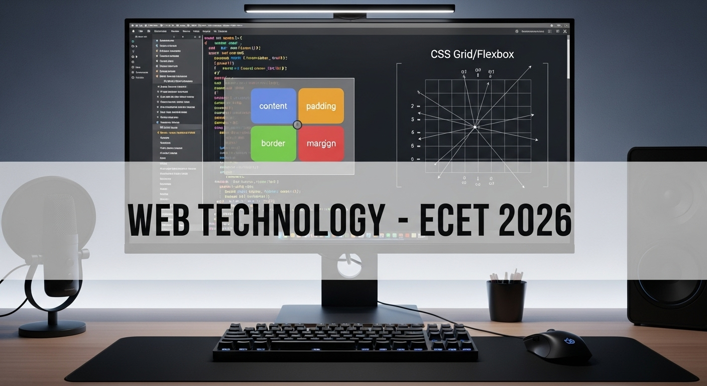
In ECET 2026 Web Technologies, CSS questions are important. Box Model & Layouts are repeated topics and very scoring.
📘 Concept Notes
🎨 CSS Box Model
Every HTML element is treated as a box. It consists of:
- Content – actual text/image inside.
- Padding – space between content & border.
- Border – line surrounding padding/content.
- Margin – space outside border (separates from other elements).
👉 Formula:


Example:
div {
  width: 200px;
  padding: 20px;
  border: 5px solid black;
  margin: 10px;
}Total Width = 200 + (20+20) + (5+5) + (10+10) = 270px
🧱 CSS Layouts
- Normal Flow – default positioning (top to bottom).
- Display:
block,inline,inline-block. - Positioning:
static(default)relative(move w.r.t original position)absolute(relative to nearest positioned ancestor)fixed(relative to viewport)sticky(hybrid: scroll-based).
- Flexbox – for one-dimensional layouts (rows/columns).
- CSS Grid – for two-dimensional layouts (rows × columns).
Flexbox Example:
.container {
  display: flex;
  justify-content: space-between;
}Grid Example:
.container {
  display: grid;
  grid-template-columns: 1fr 1fr 1fr;
  gap: 10px;
}10 Expected MCQs – ECET 2026
Q1. Which part of CSS box model lies outside the border?
A) Padding
B) Margin
C) Content
D) Width
Q2. Formula for total element width is?
A) Content + Padding + Border + Margin
B) Content + Margin only
C) Border + Content
D) None
Q3. CSS property to change inner space between content & border?
A) margin
B) padding
C) border
D) width
Q4. Which positioning keeps element fixed even when scrolling?
A) relative
B) absolute
C) fixed
D) static
Q5. Flexbox is mainly used for:
A) 2D layouts
B) 1D layouts
C) Styling text
D) Adding colors
Q6. CSS Grid is mainly used for:
A) Single column layout
B) Complex 2D layouts
C) Inline text flow
D) Floating images
Q7. In position: absolute;, element is positioned relative to:
A) Viewport
B) Parent (static)
C) Nearest positioned ancestor
D) Top of page
Q8. Default value of CSS position is?
A) static
B) relative
C) absolute
D) fixed
Q9. CSS property for spacing between elements (outside border) is?
A) padding
B) margin
C) border-spacing
D) gap
Q10. In Flexbox, justify-content: space-between means?
A) Equal space around items
B) Items packed at start
C) First at start, last at end, equal space in middle
D) Equal space between + around items
✅ Answer Key
| Q.No | Answer |
|---|---|
| Q1 | B |
| Q2 | A |
| Q3 | B |
| Q4 | C |
| Q5 | B |
| Q6 | B |
| Q7 | C |
| Q8 | A |
| Q9 | B |
| Q10 | C |
🧠 Explanations
- Q1 → B: Margin lies outside border.
- Q2 → A: Total width includes all four.
- Q3 → B: Padding controls space inside border.
- Q4 → C: Fixed elements stay on viewport.
- Q5 → B: Flexbox = 1D layouts.
- Q6 → B: Grid = 2D layouts.
- Q7 → C: Absolute depends on nearest ancestor with position.
- Q8 → A: Default position = static.
- Q9 → B: Margin = outer spacing.
- Q10 → C: Space between = start & end fixed, equal spacing in middle.
🎯 Why Practice Matters
Box Model + Layouts are repeated in ECET every year. If you practice formulas & examples, you can secure 2–3 marks in Web Tech. Also useful in real-world frontend development & interviews.
📲 Join Our ECET Prep Community
👉 Join What’s App – @LearnNewThingsHub